In health and wellness, benefits matter. Ingredients matter. Claims matter.
But there is another factor influencing consumer perception long before a shopper reads a label or understands a formula.
Color.
For self-care products, color functions as a strategic signal. It communicates what a product does, how it should make someone feel, and whether it belongs in a consumer’s daily ritual.
Research consistently shows how powerful color is in influencing behavior. Consumers make an initial judgment about a product within roughly 90 seconds, and 62–90% of that assessment is based on color alone.
For self-care brands, color becomes a silent communicator of benefits, mood, and identity.
Color Is the First Signal of Product Benefit
Self-care products promise outcomes that are often emotional as much as functional. Color bridges the gap between the functional claim and the emotional experience. Research in neuroscience and marketing consistently shows that warm colors (red, orange, yellow) stimulate excitement and urgency, while cool colors (blue, green, purple) tend to signal calmness, balance, and restoration.
That is precisely why color has become so intentional across modern wellness brands. Before a consumer reads a word, the color palette tells them:
• This product will energize me
• This product will calm me
• This product feels natural or clean
• This product feels premium or clinical
For marketers, choosing the wrong color can create friction between the benefit and the perception.
The Colors Trending in Self-Care and What They Communicate
Across beauty, supplements, hydration, and wellness brands, several color families have emerged as dominant signals.
Green: Natural, Botanical, and Regenerative
Green remains one of the most powerful colors in health and wellness.
It signals:
• Plant-based ingredients
• Sustainability and environmental responsibility
• Calm and restoration
Studies show that green tones can create a psychological association with health and stress reduction, reinforcing the perception of wellness benefits.
Brands using green effectively:
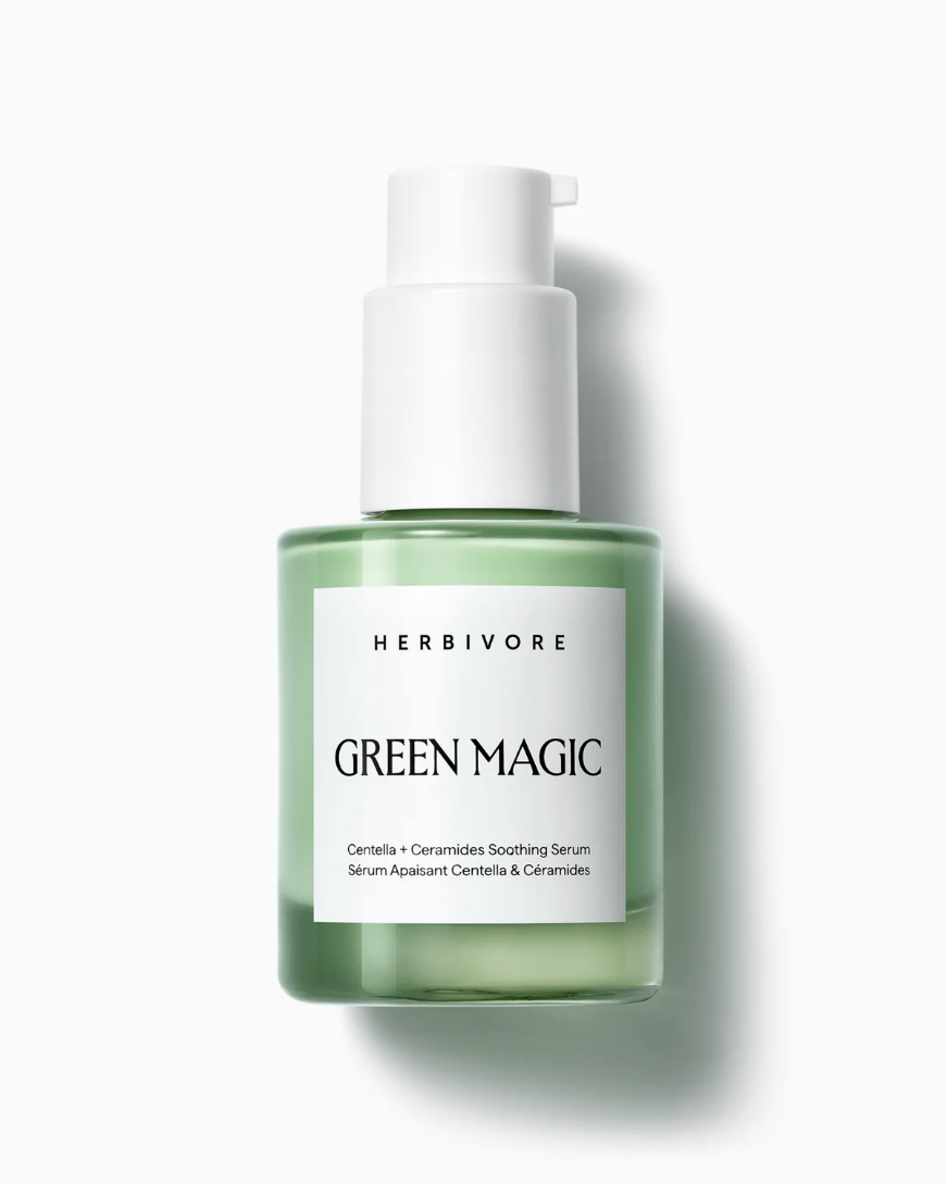
• Herbivore Botanicals uses clean moss-green glass packaging to communicate botanical purity and ingredient transparency.
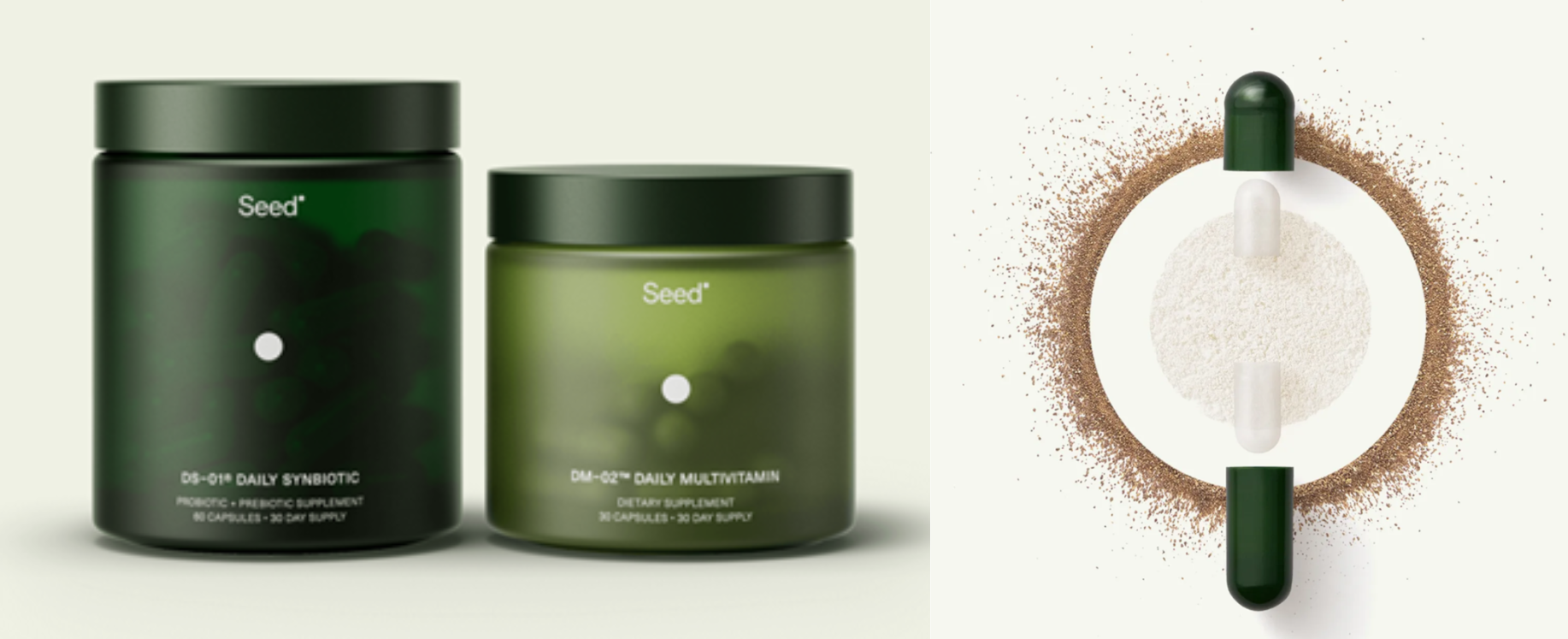
• Seed uses deep green packaging and capsules to signal natural, plant-based science, and sustainability.
For products positioned around natural ingredients or holistic health, green provides immediate credibility.
Blue: Trust, Purity, and Science-Backed Wellness
Blue is one of the most trusted colors in branding. In fact, about 40% of Fortune 500 companies use blue in their logos because of its association with reliability and stability.
In self-care, blue often signals:
• Hydration
• Purity
• Clinical efficacy
• Trust

Brands using blue strategically:
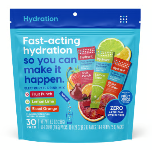
• Hydrant electrolyte drink mixes use multiple shades of blue to reinforce hydration.
• La Roche-Posay uses its distinct blue square logo and accents across packaging to communicate dermatological science, clinical testing, and trusted skincare efficacy.
Purple: Relaxation, Sleep, and Emotional Restoration
Purple has become the dominant color of sleep and relaxation.
It communicates:
• Calmness and tranquility
• Evening rituals
• Emotional balance
Many sleep supplements, magnesium blends, and nighttime beauty products lean heavily into lavender or deep violet tones.
Brands embracing purple:
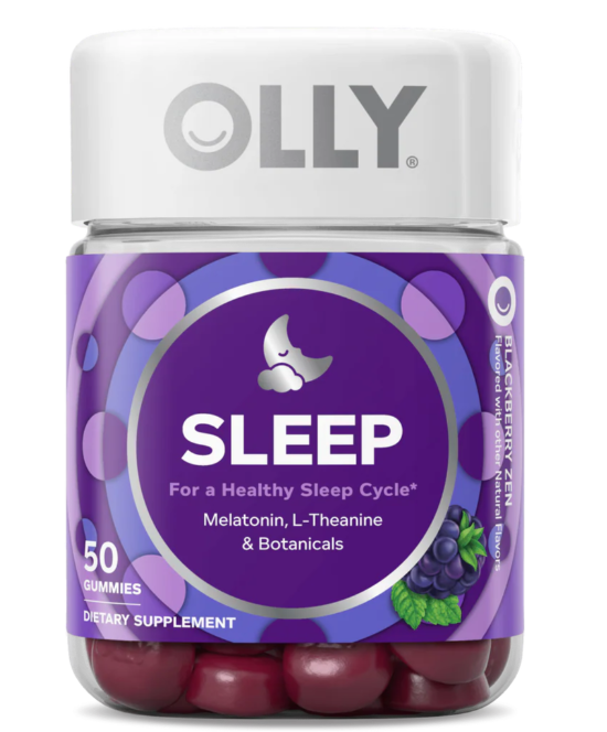
• OLLY Sleep Gummies uses bright violet packaging to signal nighttime support.
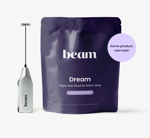
• Beam Dream Powder uses deep, rich purples to reinforce relaxation and evening rituals.
Purple also carries a subtle association with luxury, which helps elevate wellness products into ritual experiences.
Yellow and Orange: Energy, Mood, and Daily Vitality
Warm colors create attention and excitement.
Research shows that colors like red and orange can stimulate impulse buying and heightened emotional response.
In self-care, yellow and orange typically represent:
• Energy and vitality
• Morning routines
• Mood enhancement
• Immunity support
Brands leaning into these tones:
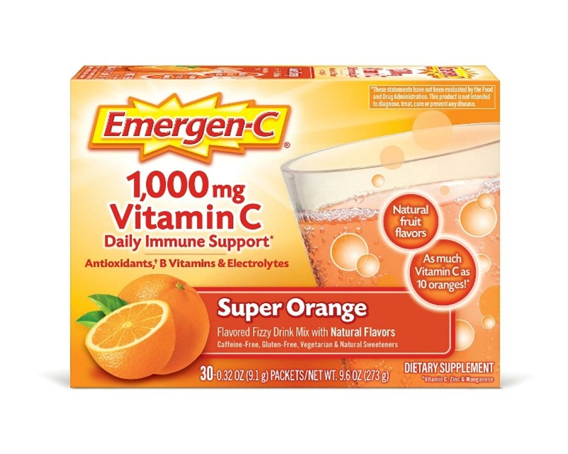
• Emergen-C uses bright orange packaging and “Super Orange” flavor branding to signal vitamin C potency, immune defense, and daily energy support.
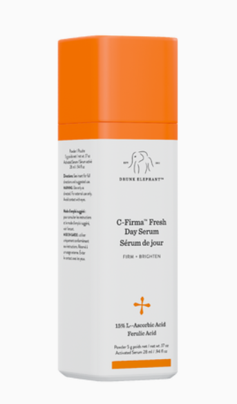
• Drunk Elephant’s C-Firma Fresh Day Serum uses vibrant orange packaging to signal its role in a morning skincare routine while reinforcing the product’s brightening, vitamin-C–driven glow benefits.
Soft Neutrals and Pastels: Minimalism and Premium Wellness
A newer trend across the self-care category is the rise of soft neutral palettes.
These colors communicate:
• Clean ingredients
• Simplicity
• Luxury self-care rituals
Minimal palettes are common among modern wellness brands targeting millennial and Gen Z consumers seeking aesthetic coherence in their routines.
Brands leading this approach:
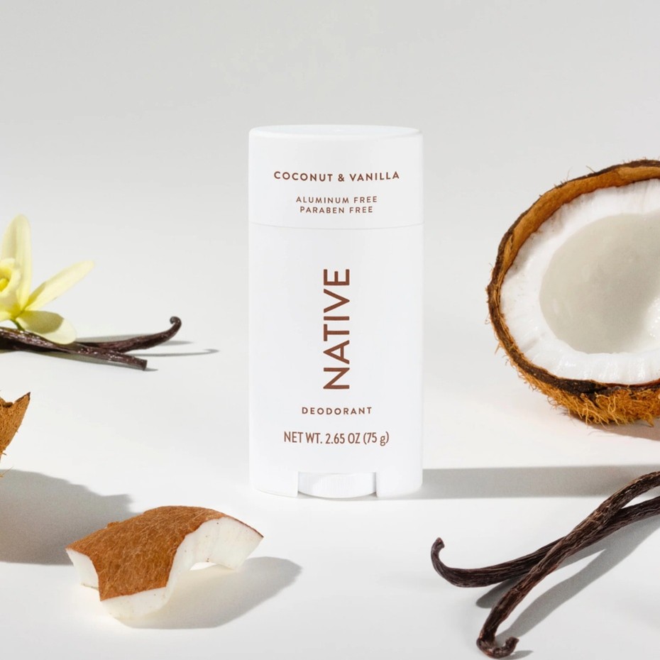
• Native uses muted, minimalist packaging and soft color palettes to visually reinforce its positioning around simple, clean ingredients and modern personal care.
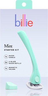
• Billie uses soft pastel colors across its razors and body care packaging to communicate gentle formulations, modern simplicity, and an approachable self-care experience.
Minimal palettes allow the product experience itself to feel calm and intentional.
Color as a Competitive Advantage in Self-Care
The wellness category is increasingly crowded.
Consumers are navigating thousands of products promising similar benefits. Packaging color becomes a key shortcut for decision-making.
When brands choose colors aligned with consumer expectations for a category, products feel more intuitive. When they deviate strategically, they can stand out.
What This Means for Health and Wellness Marketers
For marketing leaders building the next generation of self-care brands, color deserves the same level of strategic thinking as claims, ingredients, or messaging.
Three principles consistently separate brands that get color right.
1. Align color with the emotional outcome of the product
Consumers should feel the benefit before they read the label.
2. Build a distinctive color asset
The strongest brands eventually own a color.
3. Design for shelf speed
Retail shelves and digital storefronts move quickly. Color often determines whether a consumer pauses long enough to learn more.
Closing Thoughts
Color is more than a design choice. In self-care, it is one of the fastest ways to signal benefit, emotion, and brand identity before a consumer reads a single word.
The brands that win treat color as part of their positioning strategy. The palette reinforces the product promise, creates instant recognition on shelf, and helps consumers quickly understand how the product fits into their daily ritual.
At Compass Marketing, we help health and wellness brands translate insights like these into clear positioning, compelling packaging strategies, and differentiated brand systems that perform in both digital and retail environments.

Lynda is a consumer marketing expert with a track record of successful U.S. and global product launches. She has created new product innovations across consumer wellness, from personal care to digital health. She is a founding partner of Compass Marketing.
See All Works